Project brief provided by Briefbox:
Common Unity is a Leeds-based record store and label set up in 2004.
The aim of the store has always been to represent the thriving dance music scene in the city, by supporting local artists and DJs - whilst also having an international perspective of stocking and reaching out to music producers from around the world.
The store is an integral part of the local music community and a well respected name in the city.
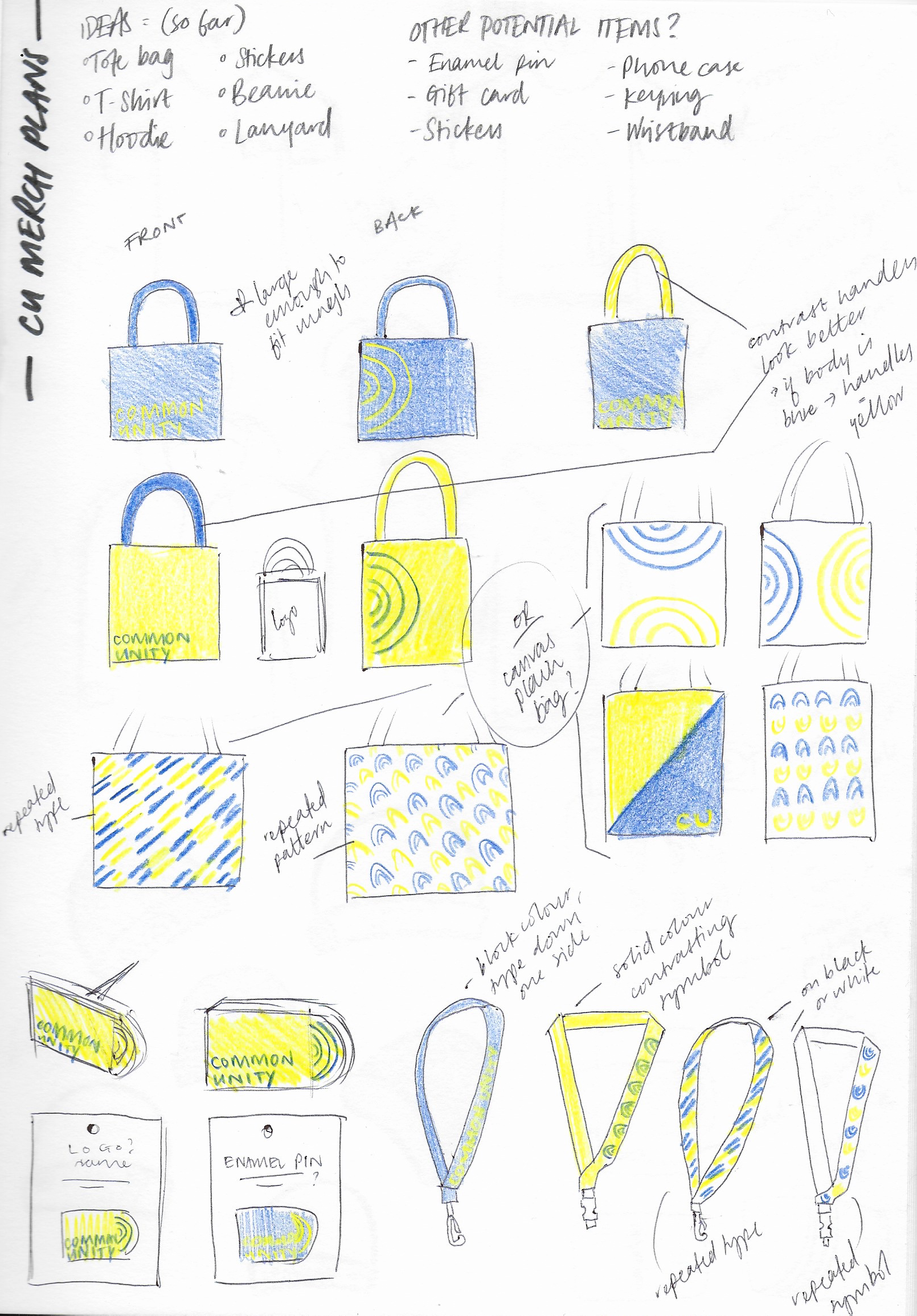
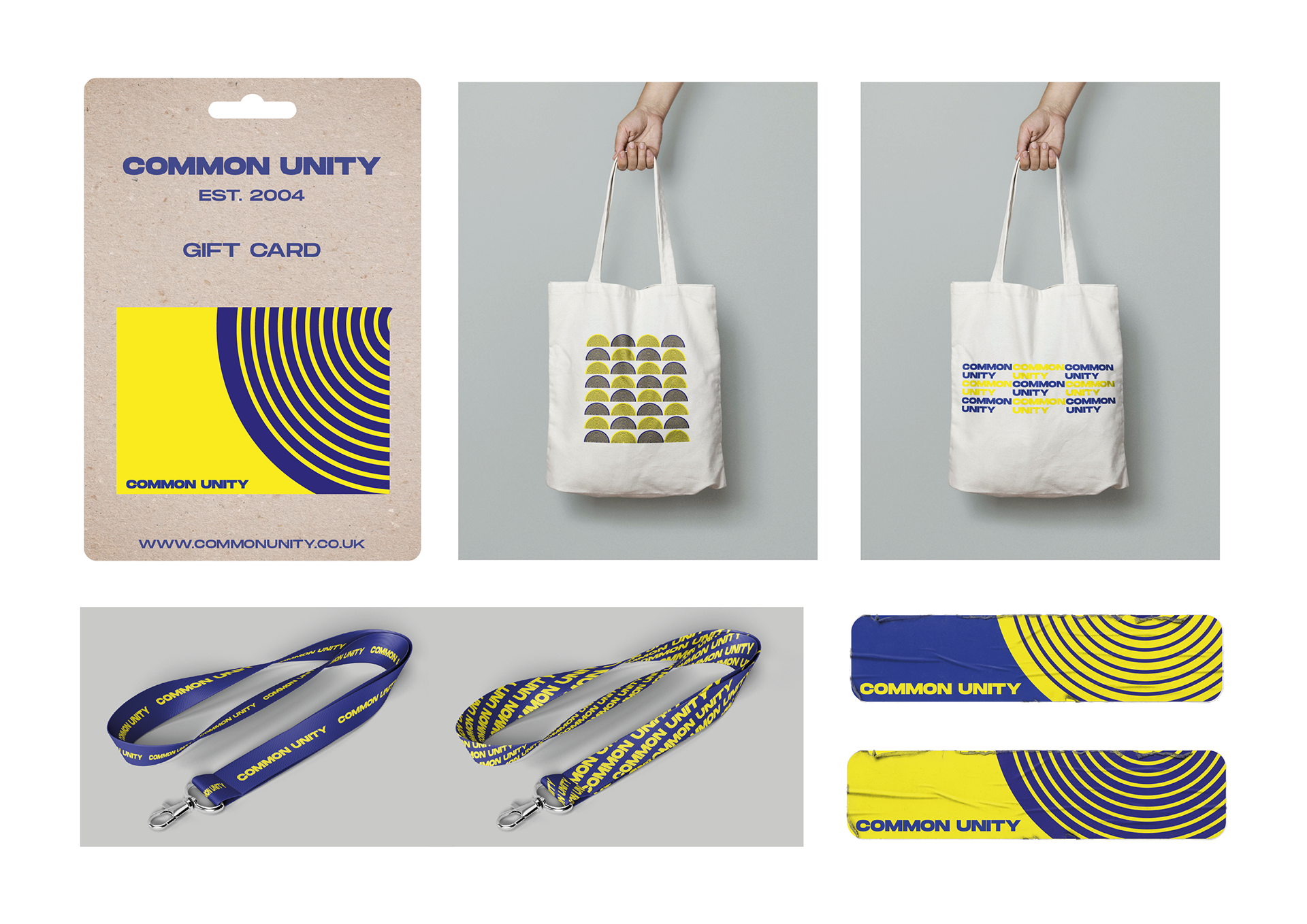
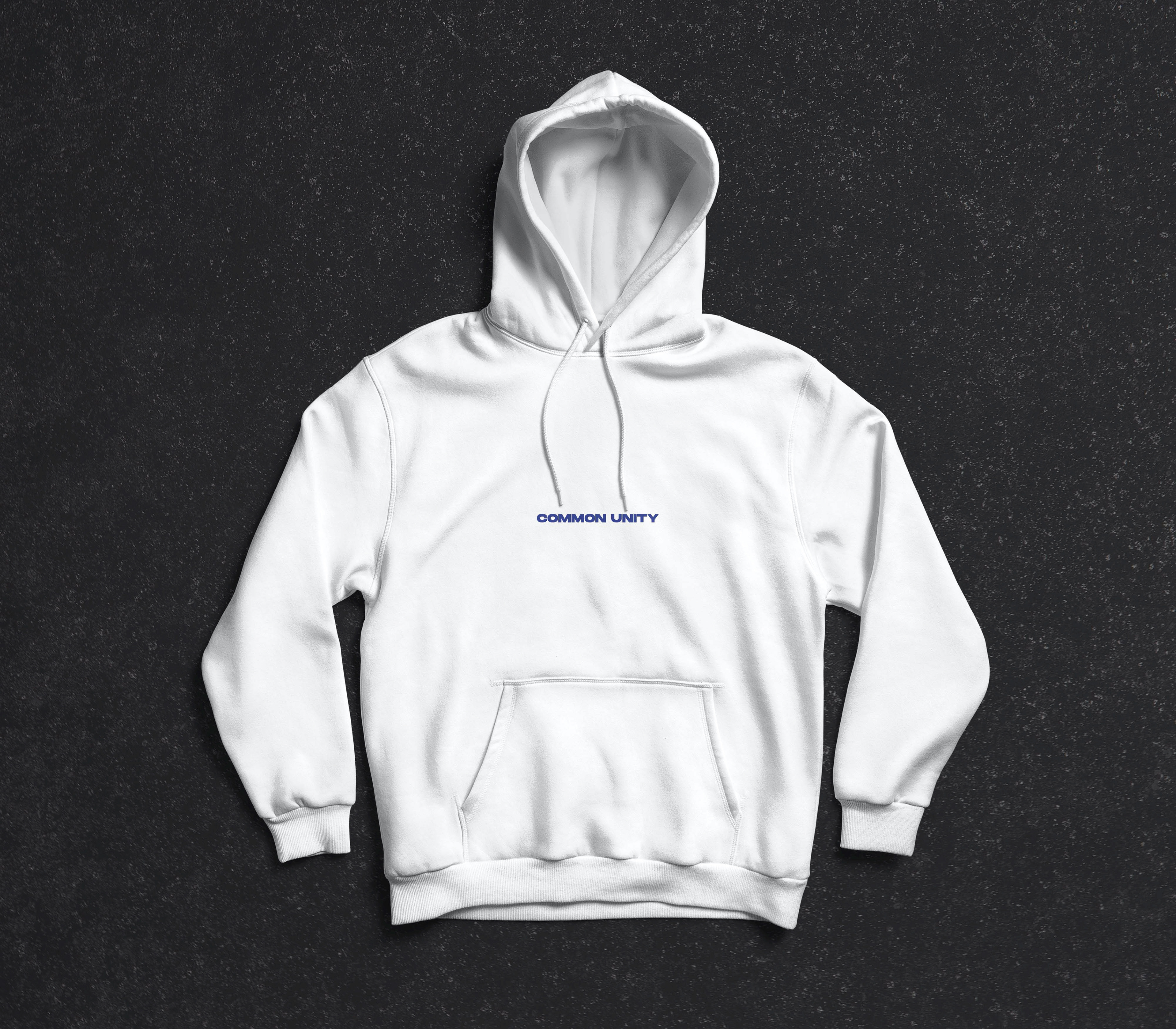
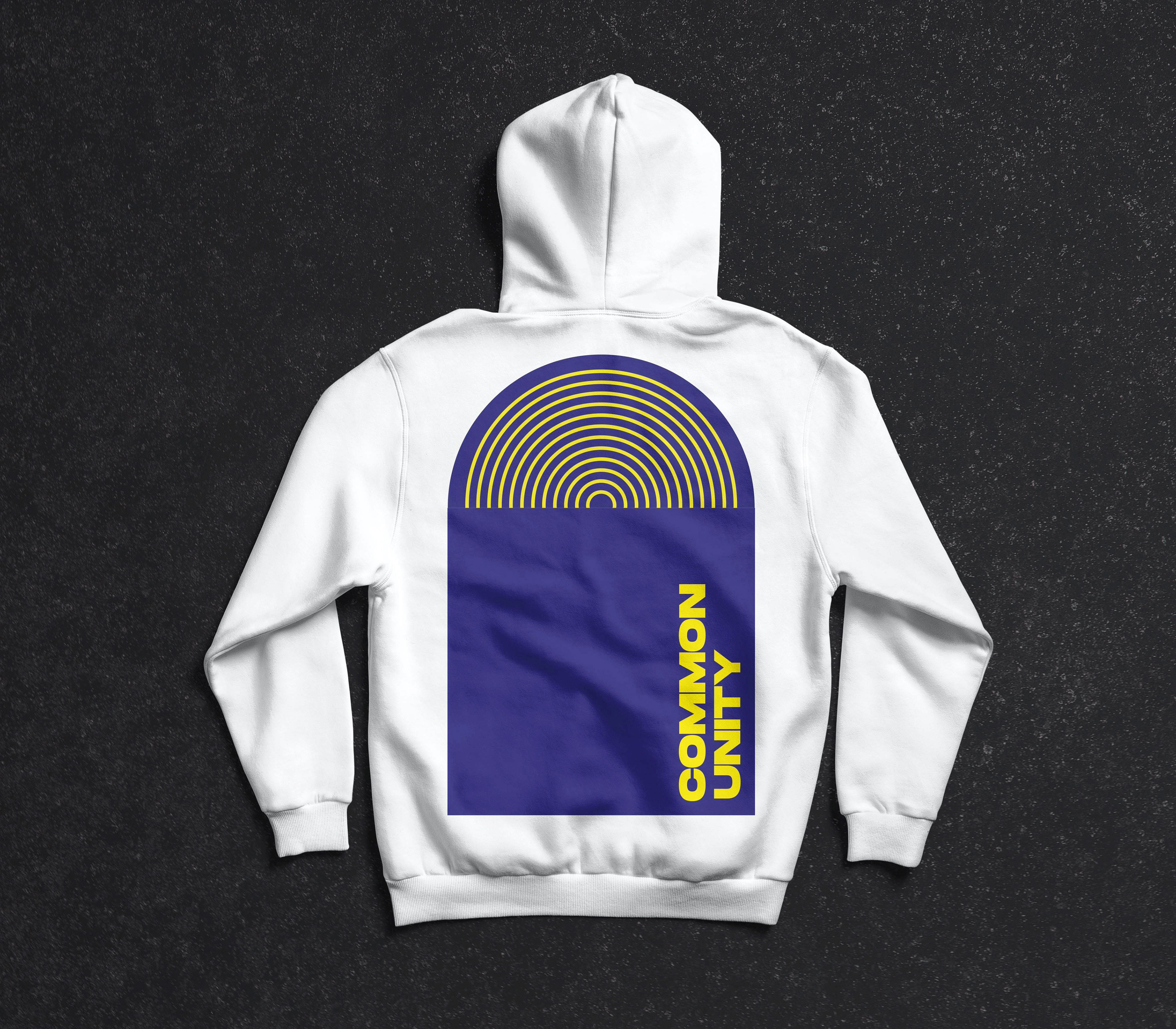
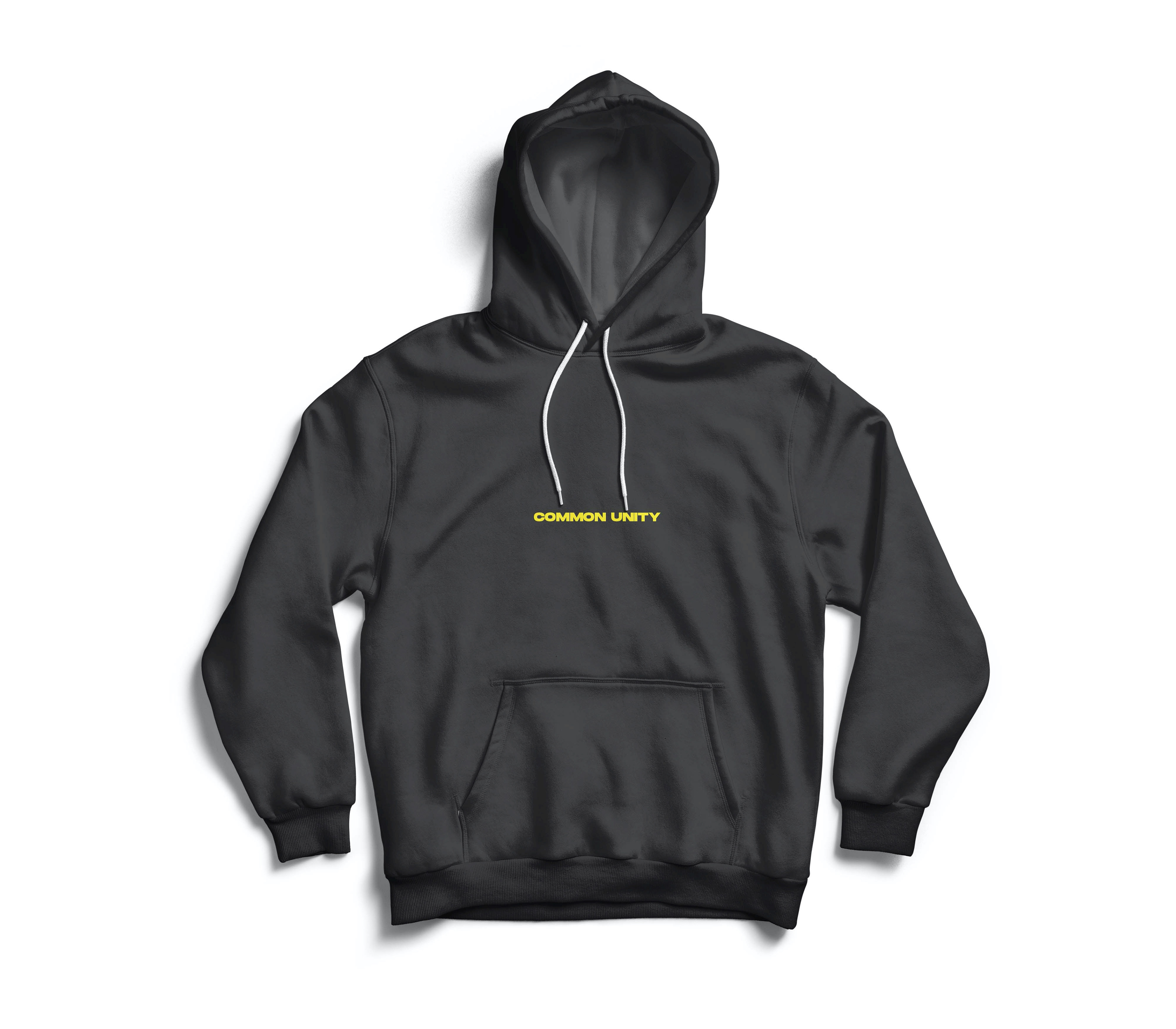
As well as stocking a wide variety of music, they also sell their own merchandise range.
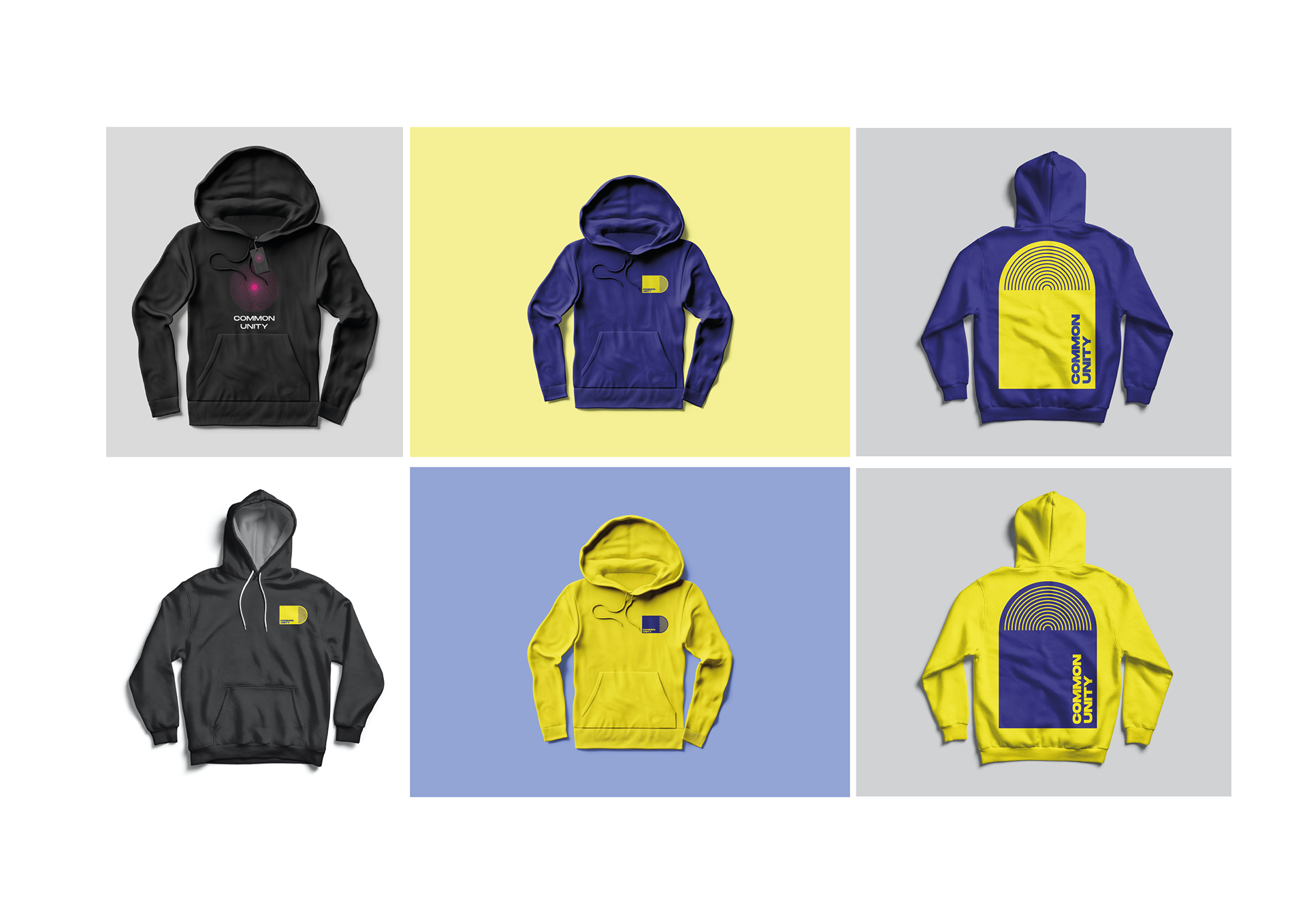
The client wants a fresh, exciting brand identity that reflects their ethos of community, boundary-pushing music and great looking street wear. They want to attract artists and customers that share the same vision and would like to see how the new brand would work across the various aspects of their business.
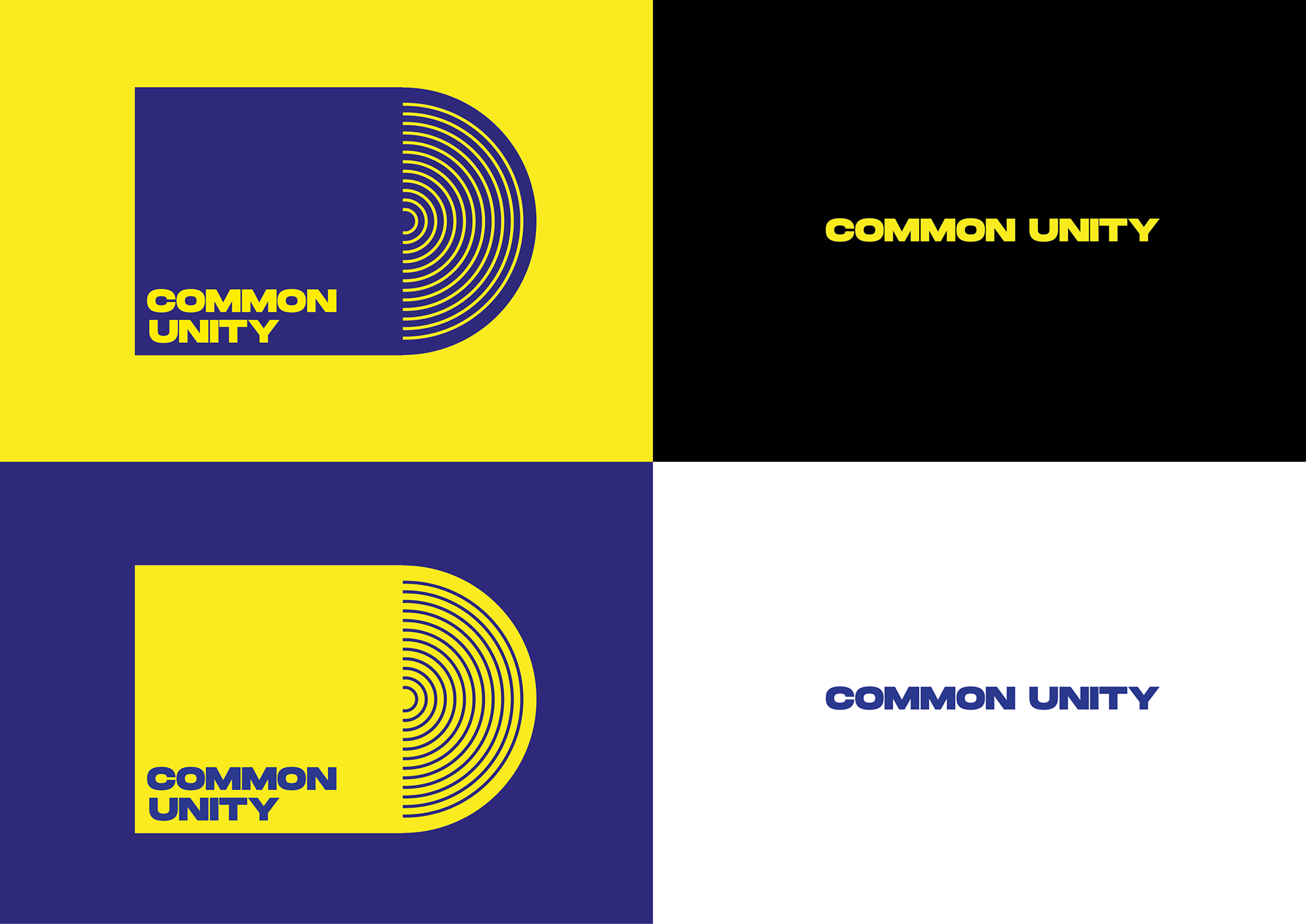
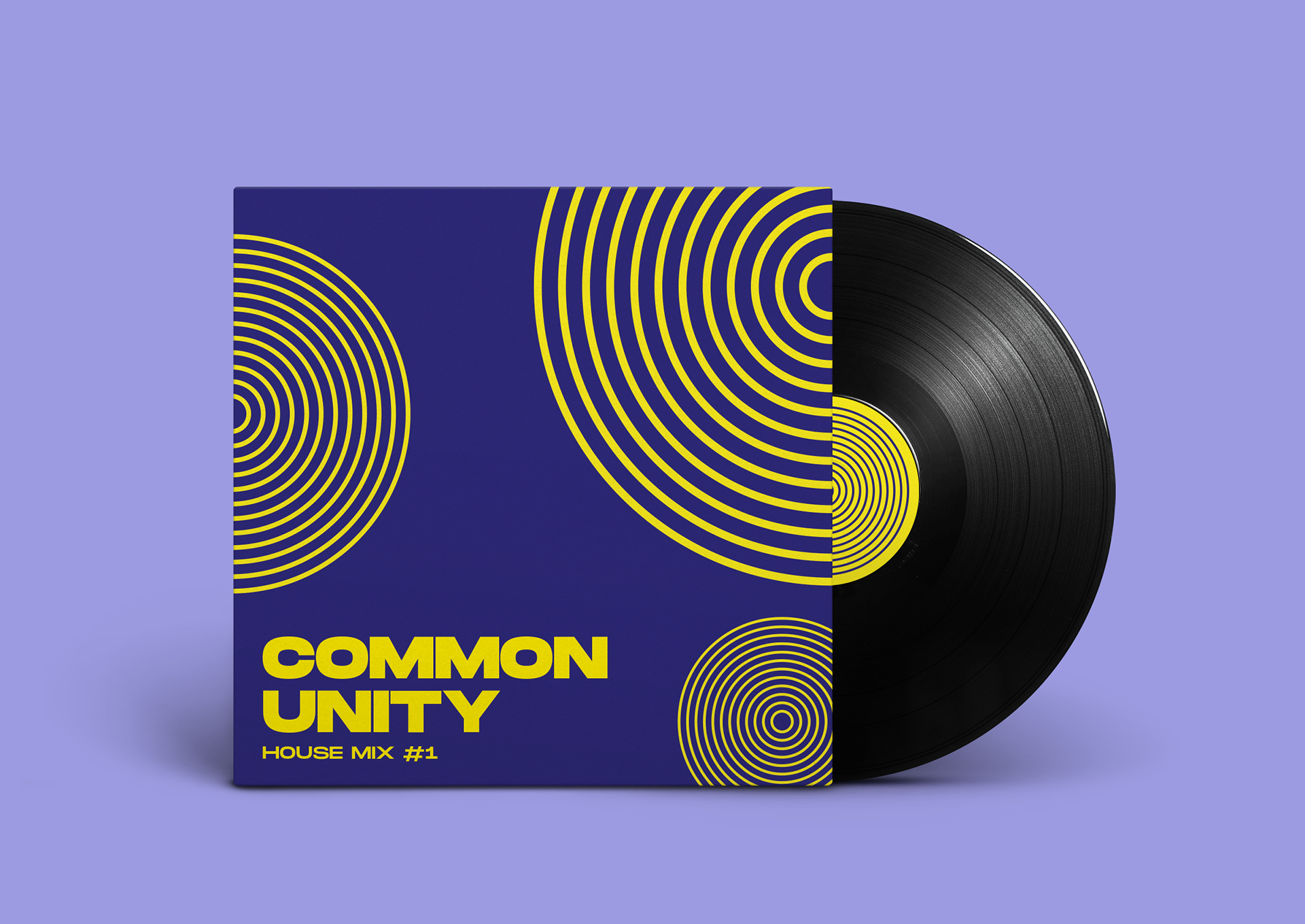
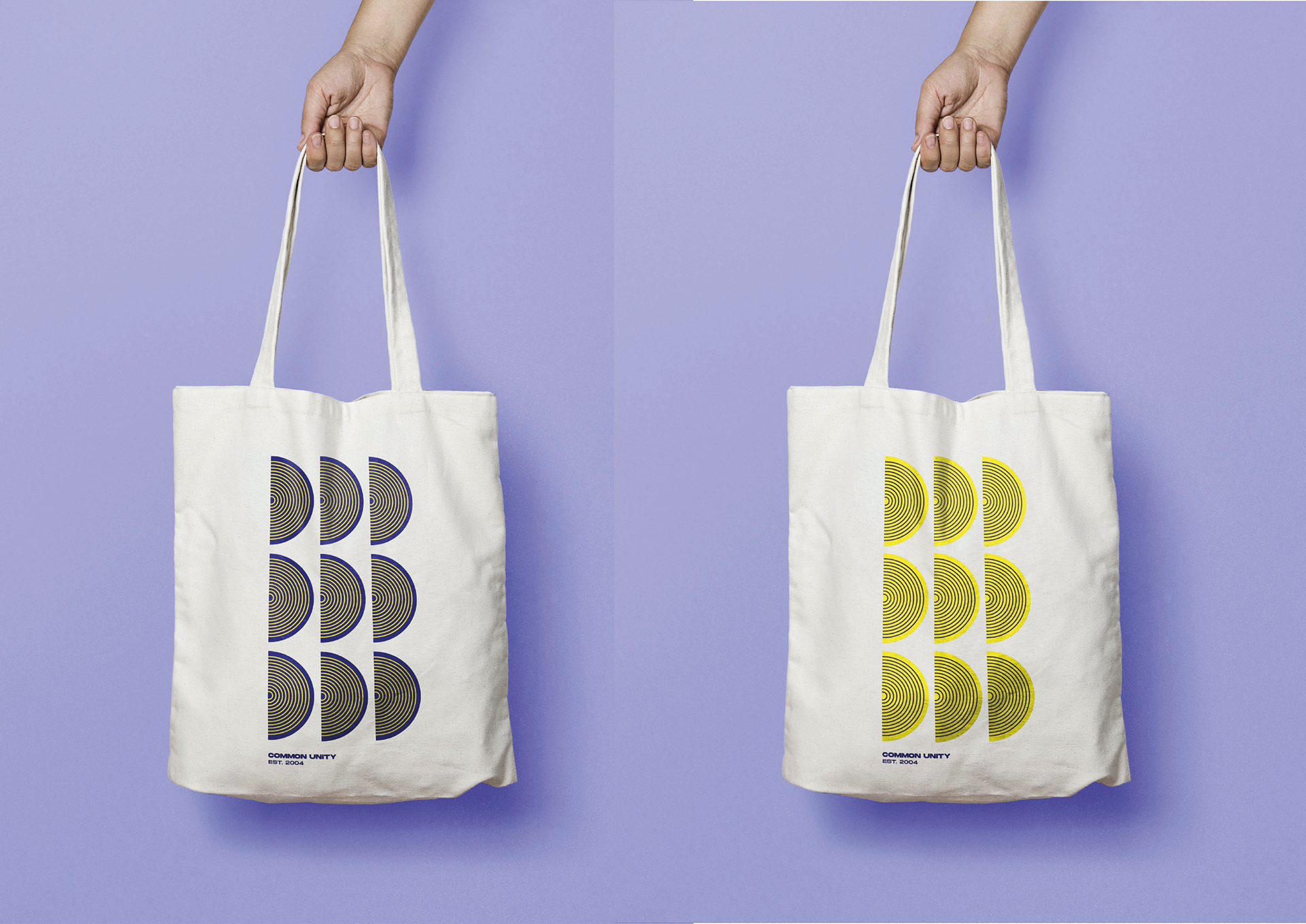
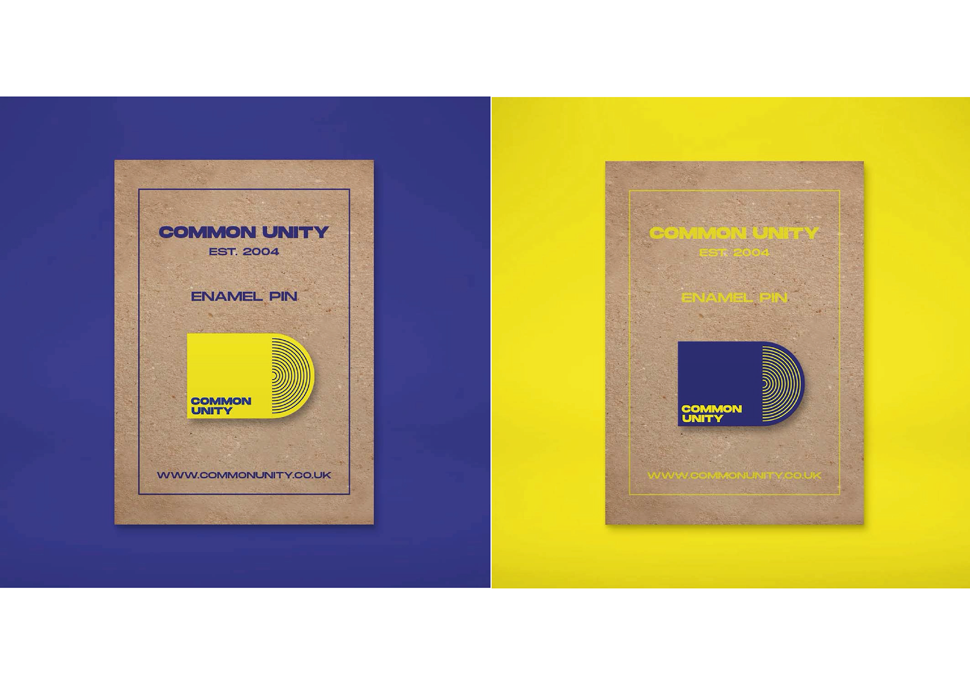
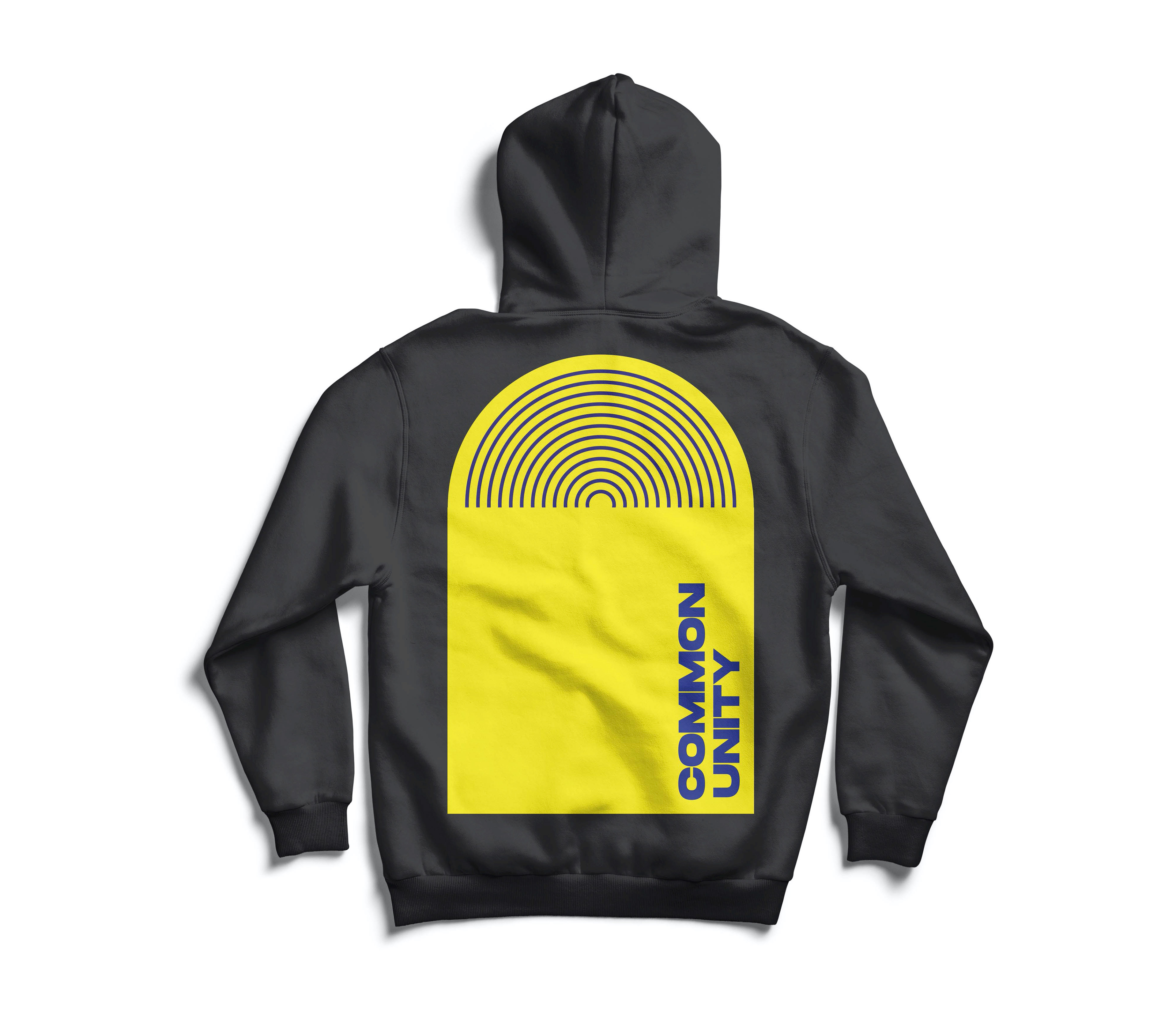
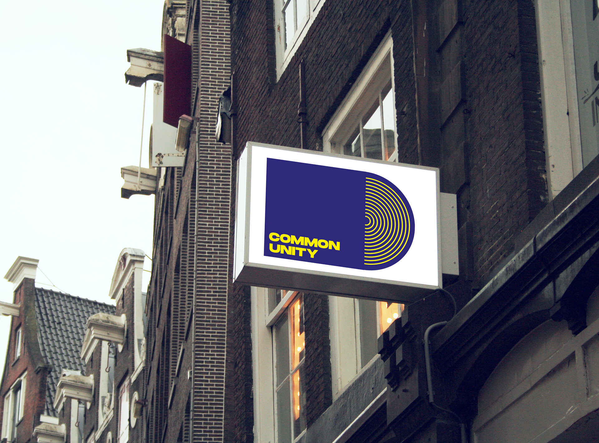
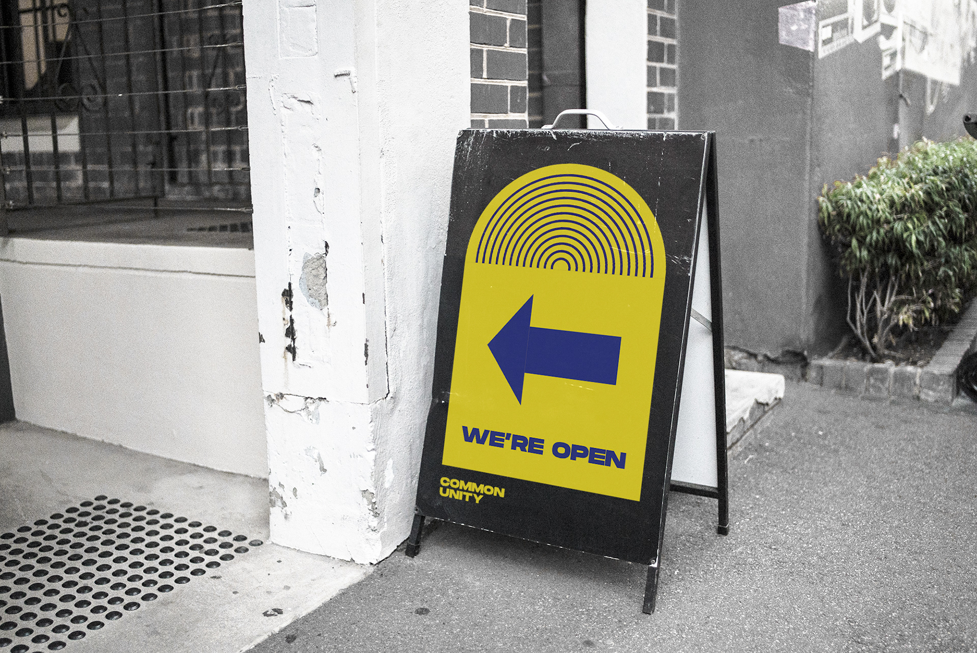
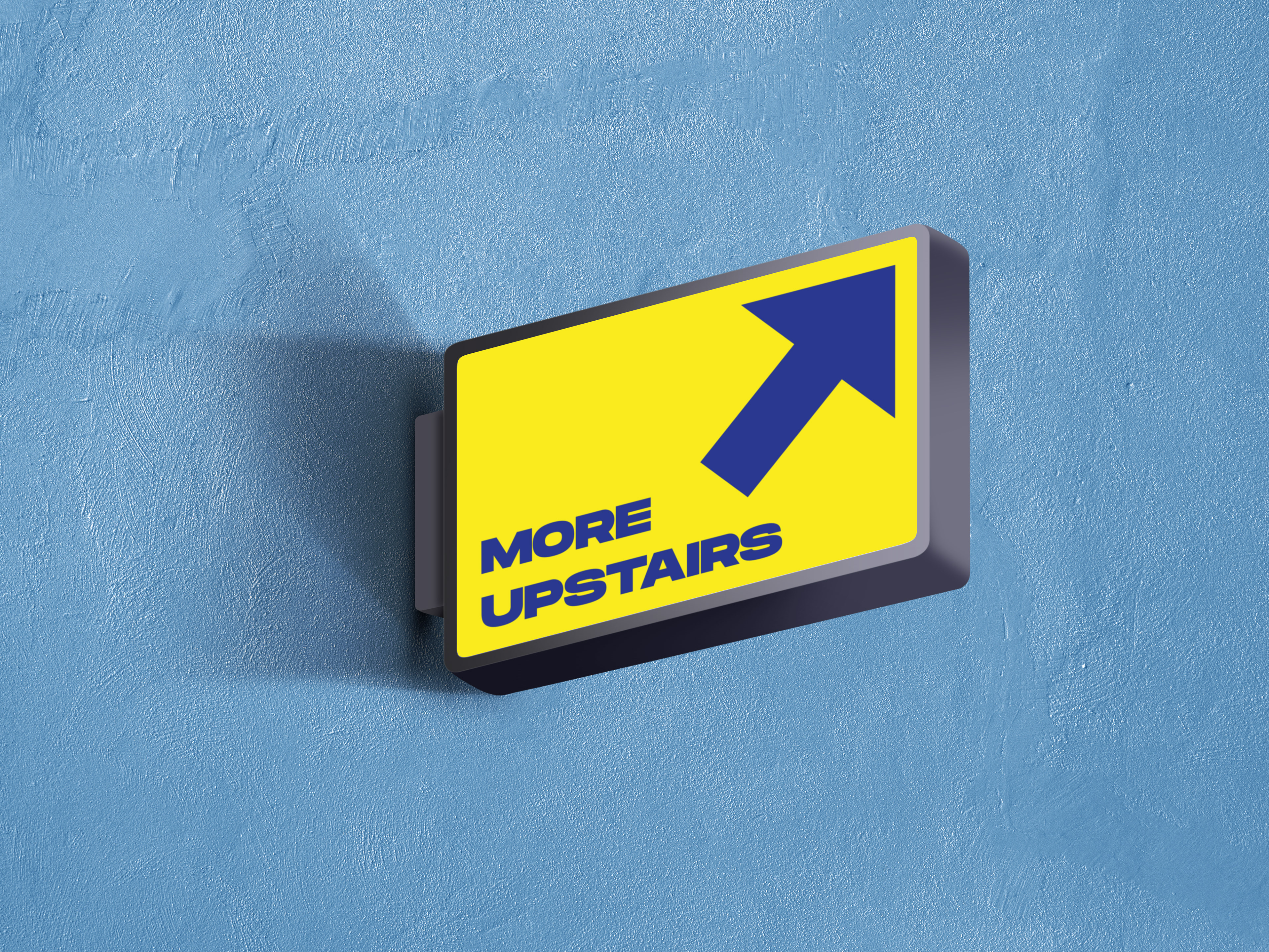
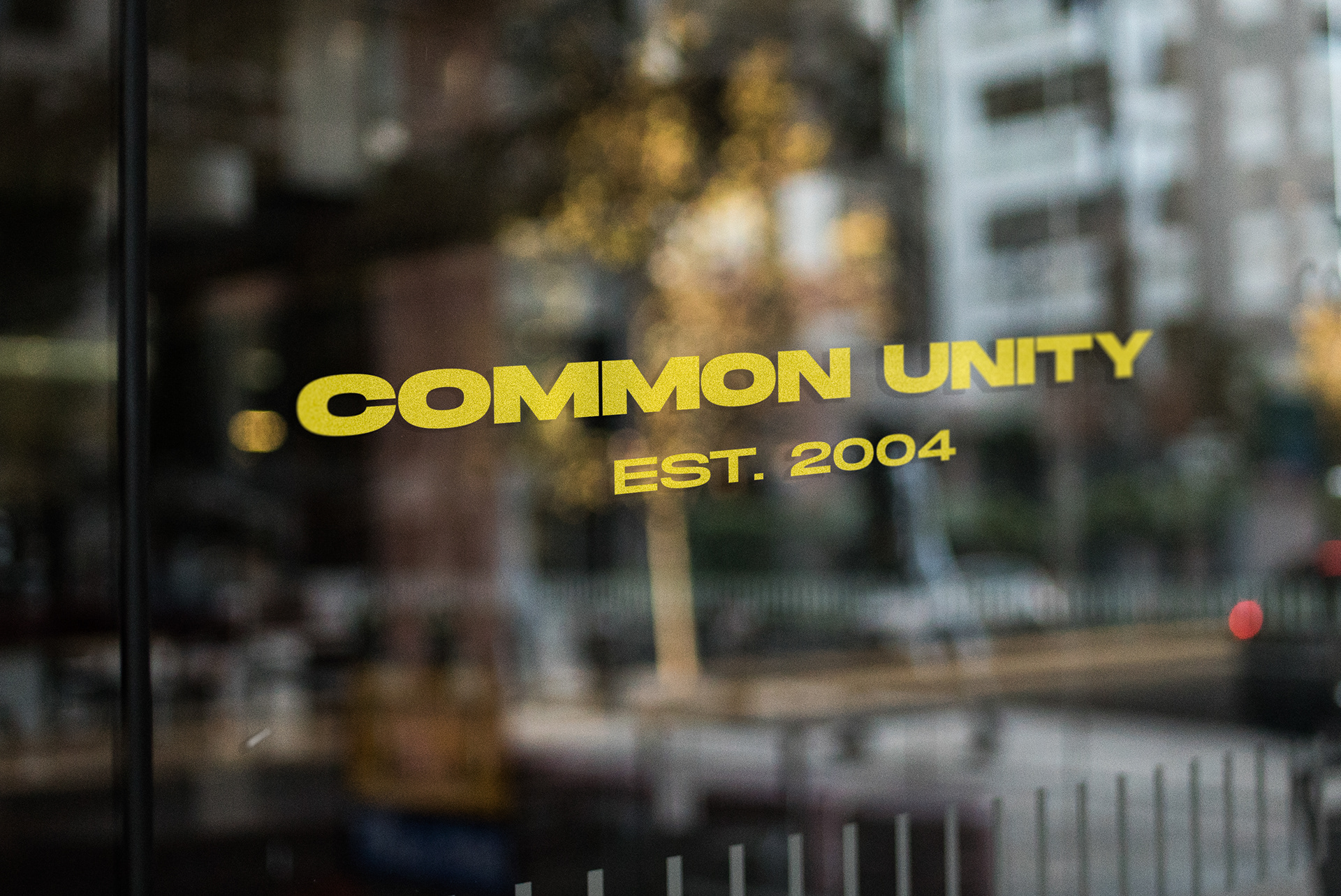
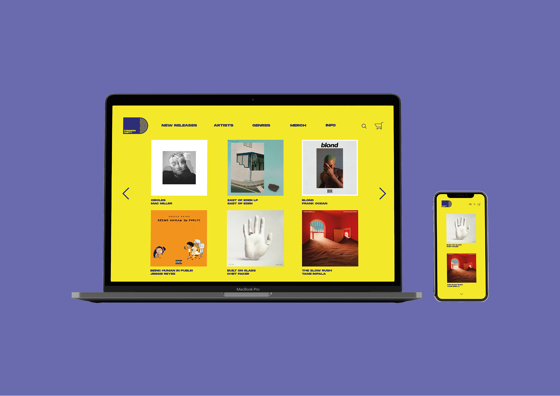
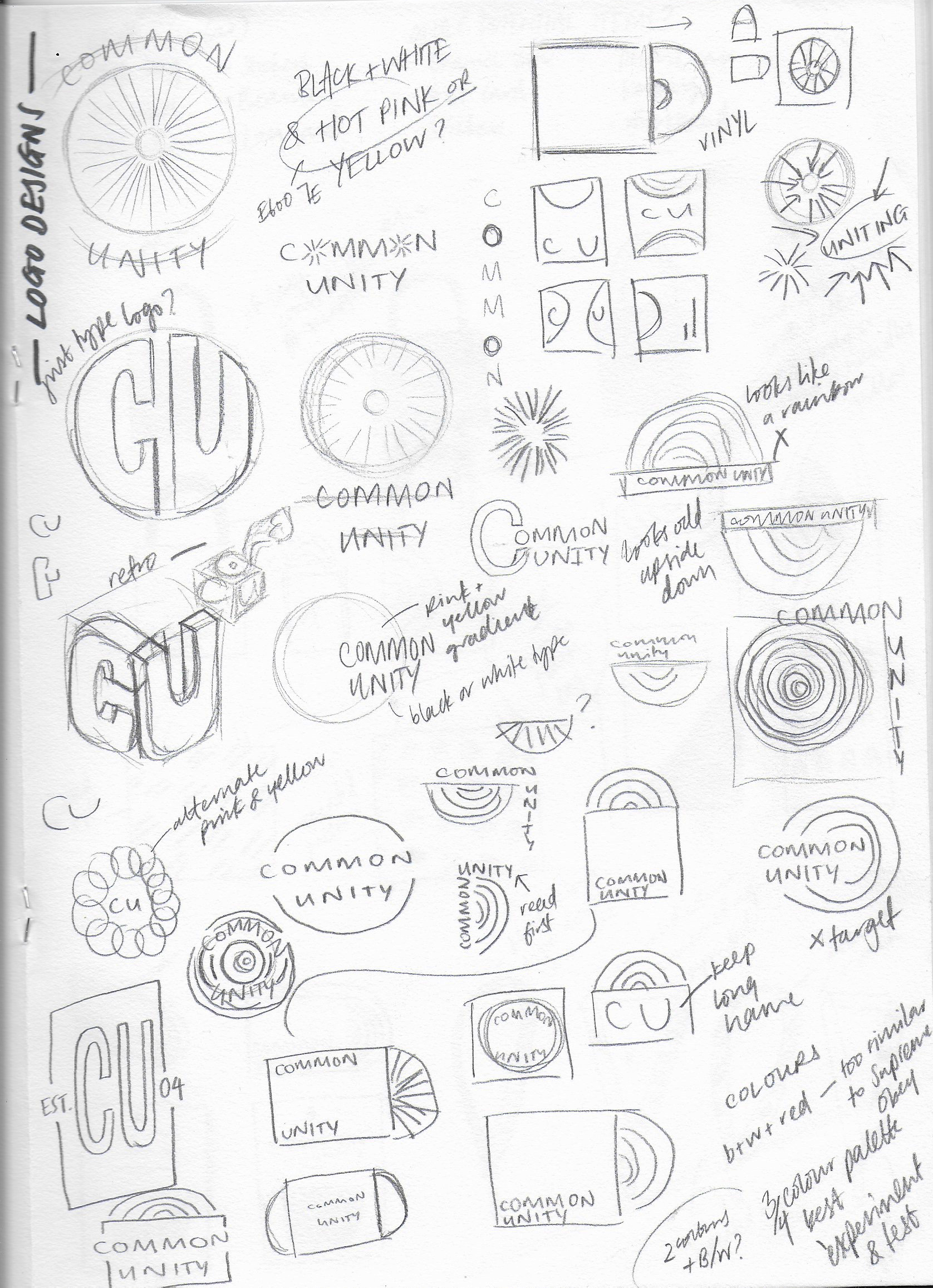
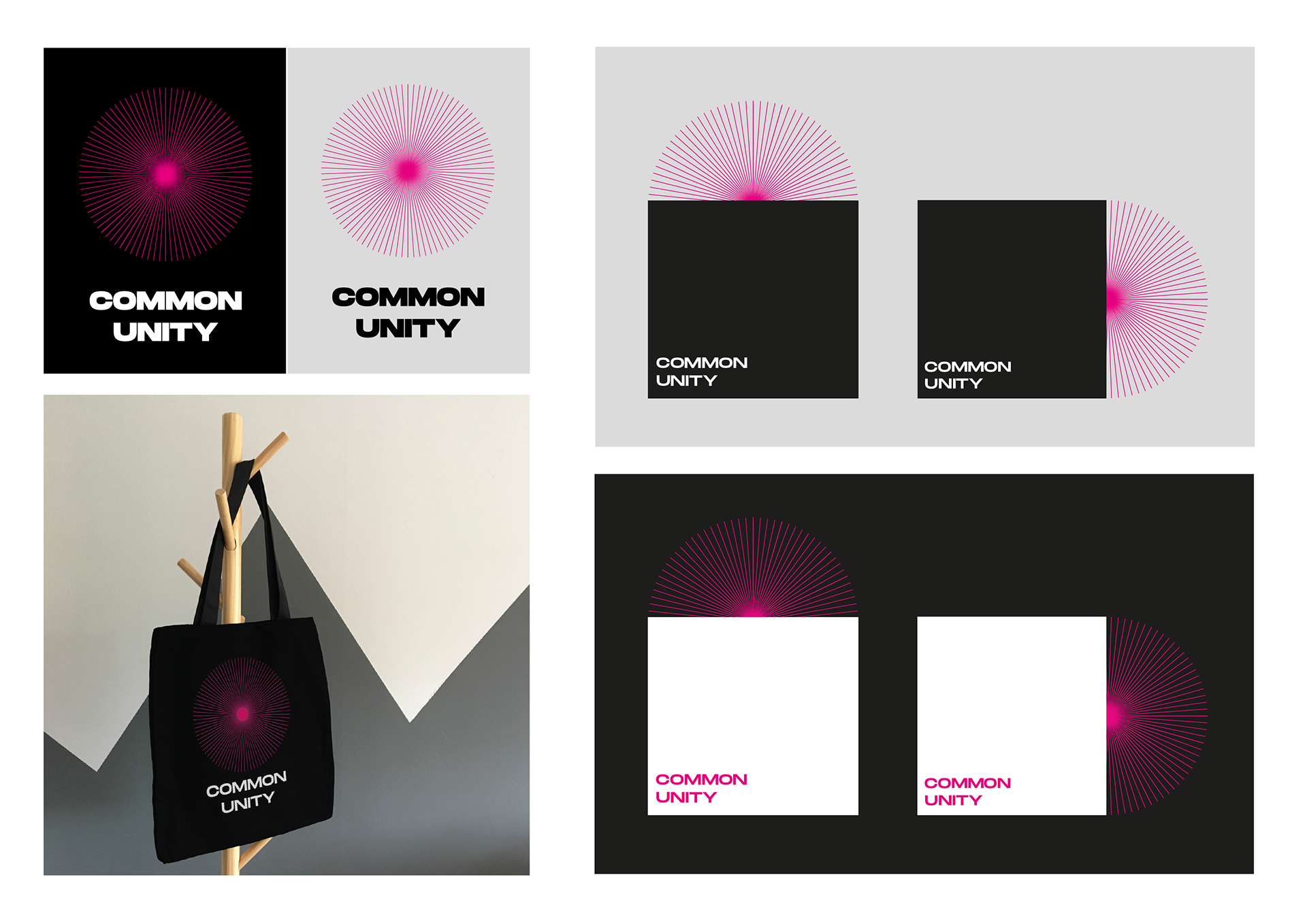
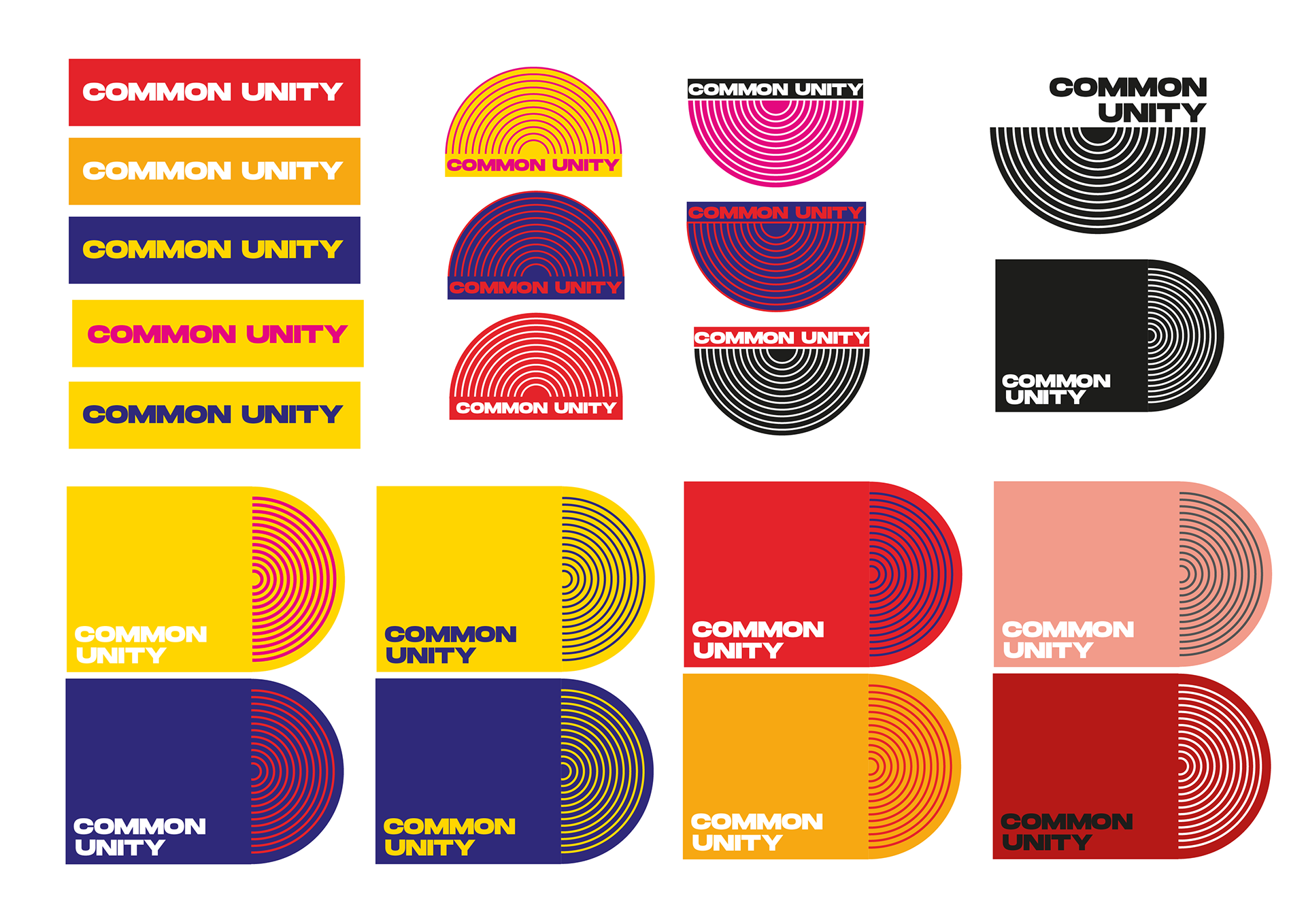
My approach to this brief was to create a brand identity which would be bold and memorable, which would need to work consistently across the brief deliverables - capable of adapting from merch to signage.
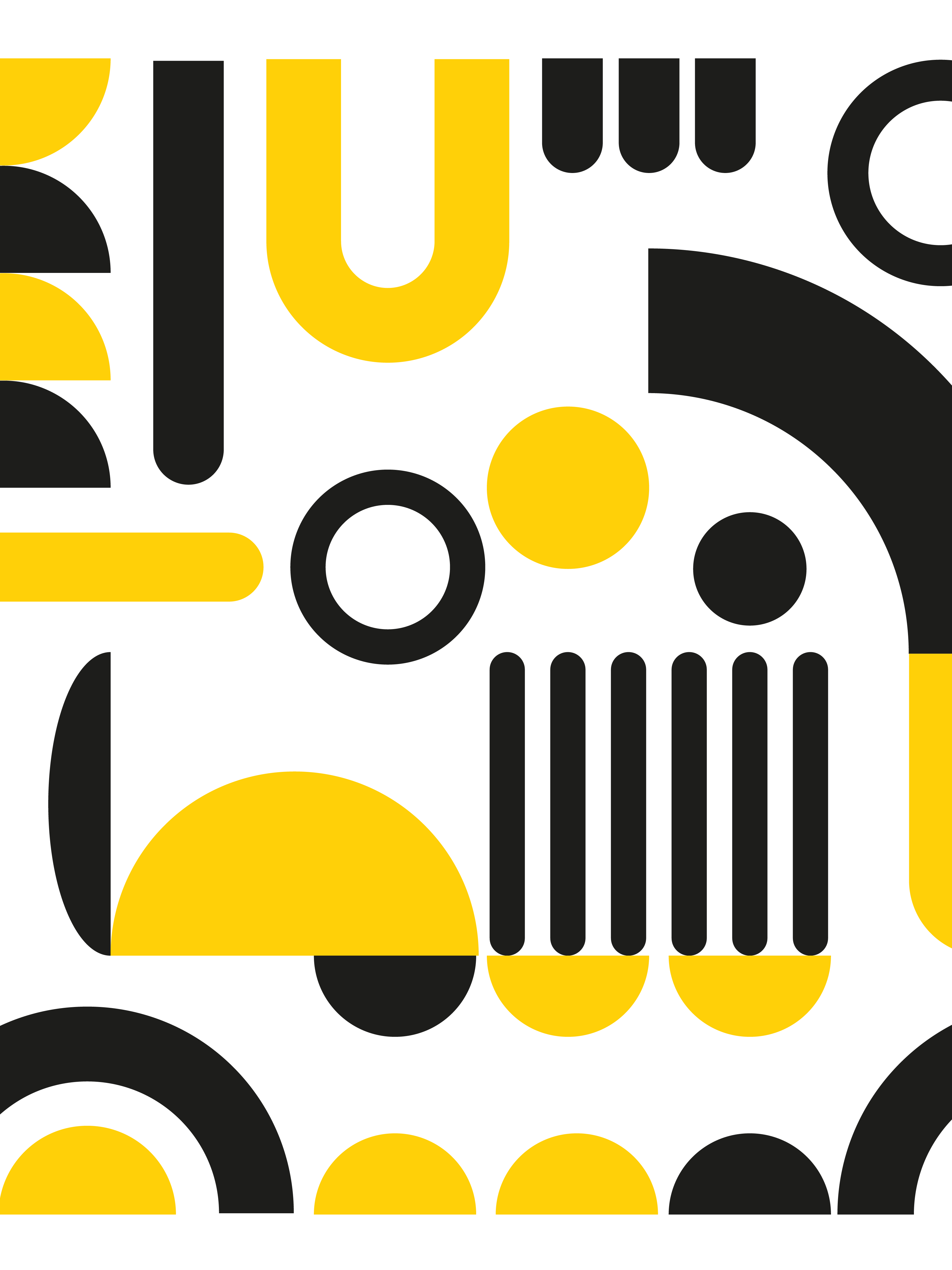
I wanted the logo to be striking, so I experimented with a range of initial designs, playing with shape and colour. I started with a black and white approach, using magenta as an accent colour. I liked the strong colour contrasts, however, I felt that I could be more playful and tried developing other colour palettes.
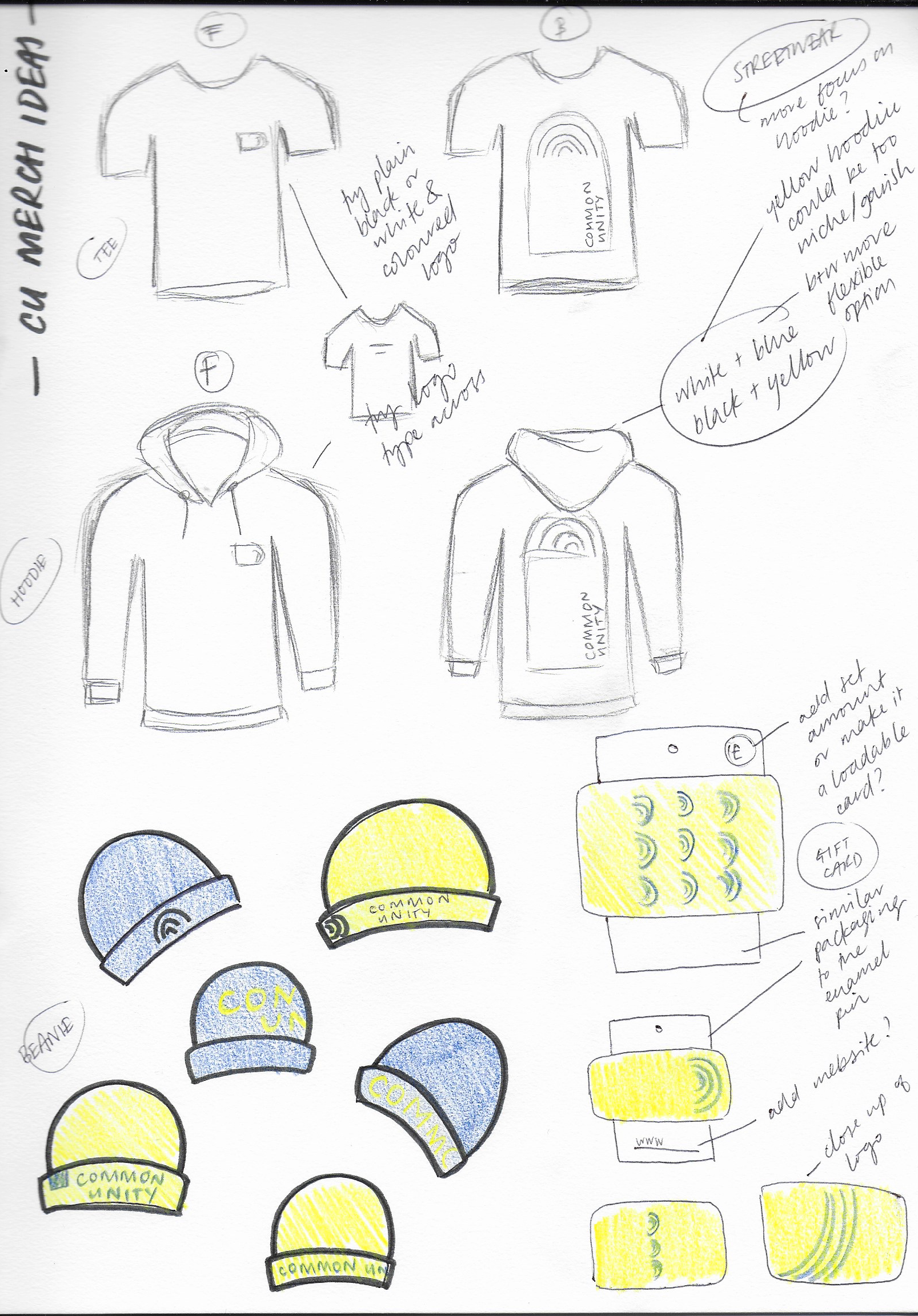
I then explored the apparel range which would be sold in-store, thinking about band merch and products which would be desirable to the target audience. As the brief mentioned streetwear, I experimented with clothing designs which was was a new challenge for me.