Project Overview:
The aim of this project was to design a desktop website for a fictitious airline start-up.
The full UX process was followed, starting with intensive and varied research, through to the design phase which included sketches, flow diagrams and prototyping.
The end goal of this project was to design and build a clickable prototype that could be tested with users, accompanied by detailed, annotated wireframes which could then be handed over to the developer team for implementation.
Project Details:
Role: UX/UI designer
Timeframe: 6 months part-time
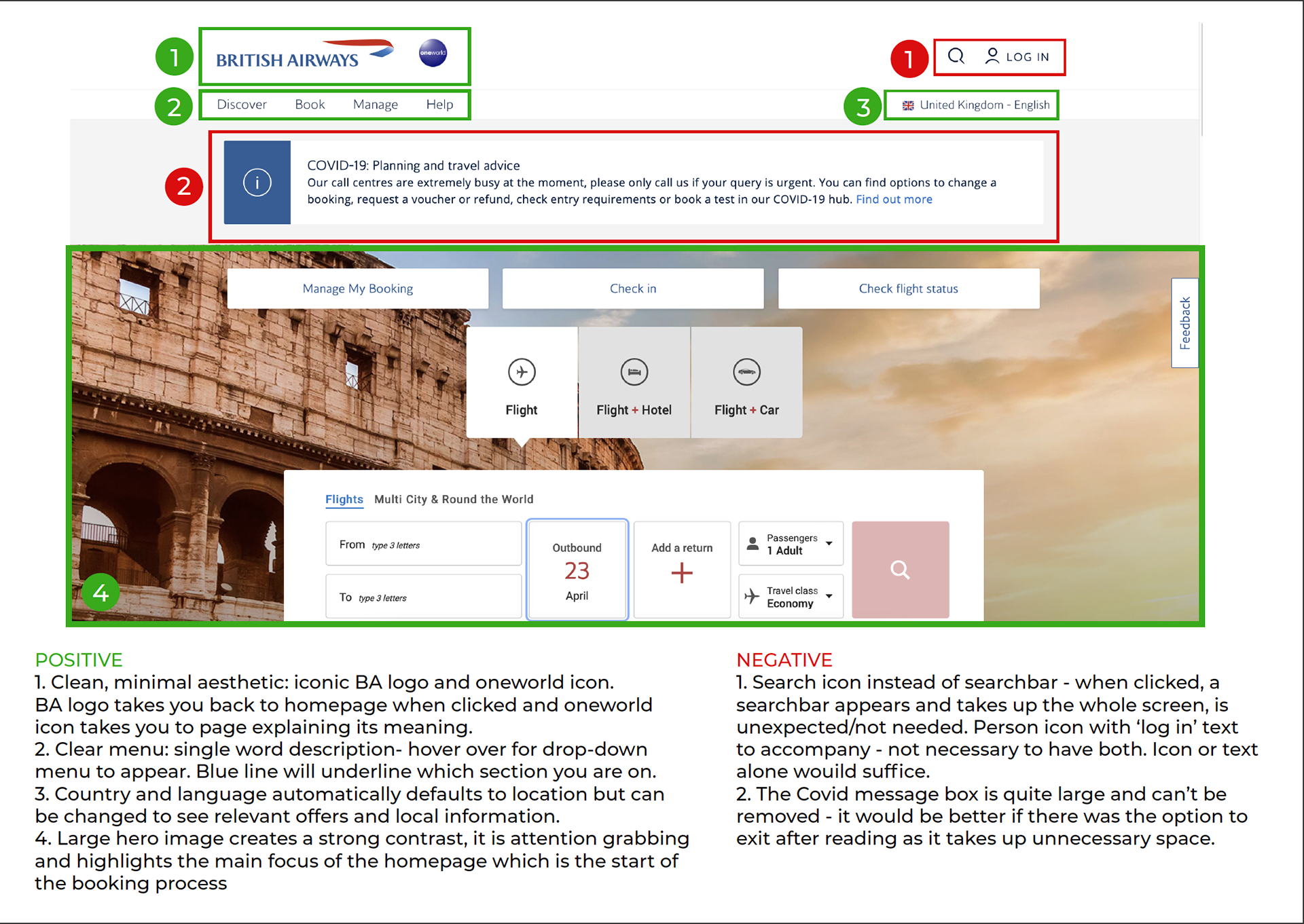
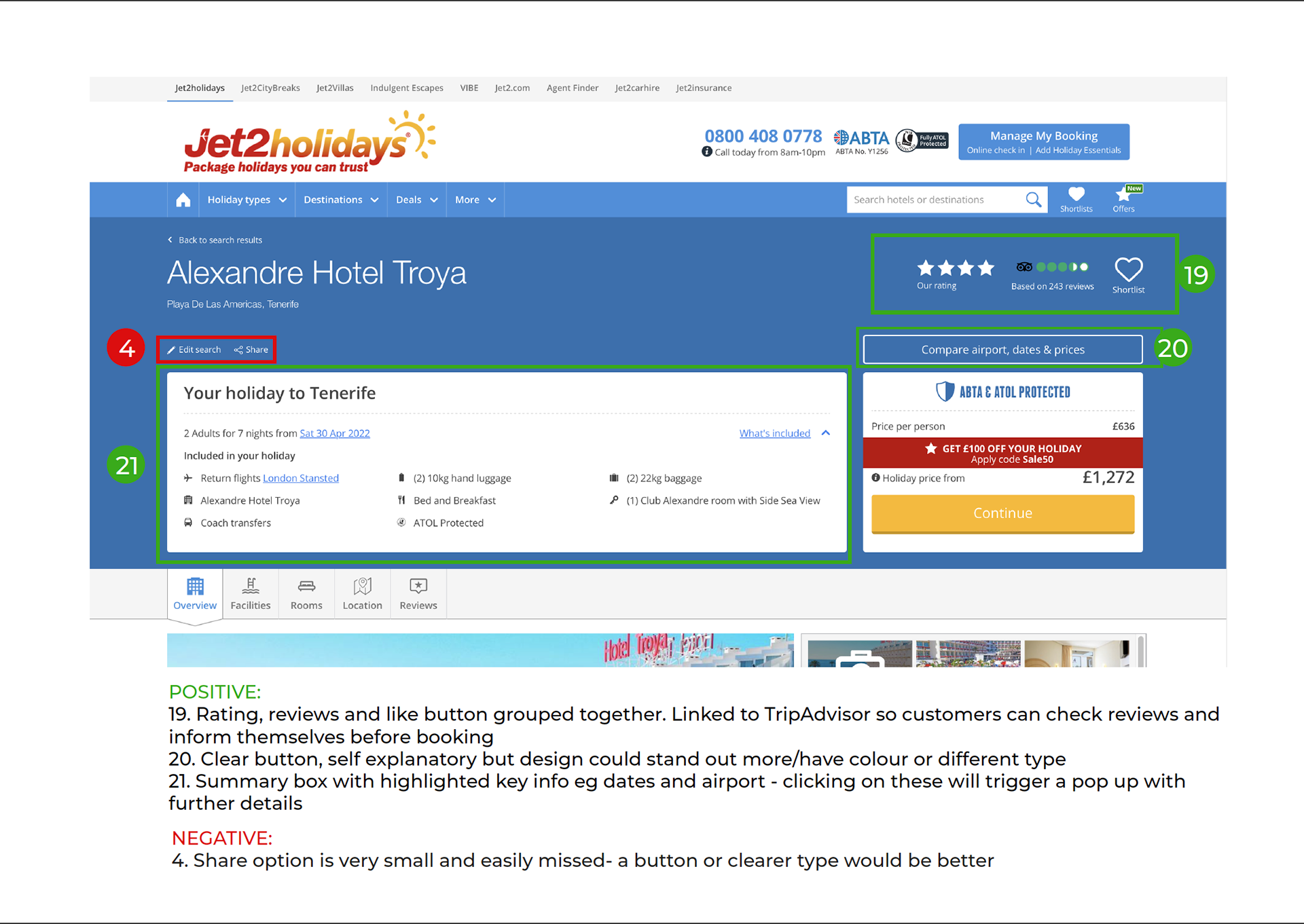
COMPETITIVE BENCHMARKING
The first step of the process was for me to obtain a better understanding of the usability of existing airline websites. In order to do this, I carried out competitive benchmarking for two popular flight booking websites - British Airways and Jet2Holidays.
The objectives of this project were to:
• learn how best in class websites solve the problem we are trying to solve
• understand the conventions we should follow
• highlight the best practice we should emulate
My approach was to go through each step of the flight booking process for each site and analyse the various aspects to see what elements I would want to emulate with my own work and what to avoid. I made comments on the aspects which seemed the most noteworthy and followed a colour-coded key to clarify the difference.
Key insights:
+ Visibility of system status - progress bar to communicate what stage of the booking process the user is currently on/has completed
+ Option to use search/filter functionality
- Inconsistent aesthetic/interface
- Difficulty comparing flight details
ONLINE SURVEYS
The next step was to conduct an online survey to send out to users in order to better understand their goals/context/behaviour; collecting both qualitative and quantitative data allowed for more in-depth insights.
The objectives of this section were to find out:
• what the user was trying to achieve during their session using that website
• what were the pain points/problems they encountered, if any
• what potential features they would like to see
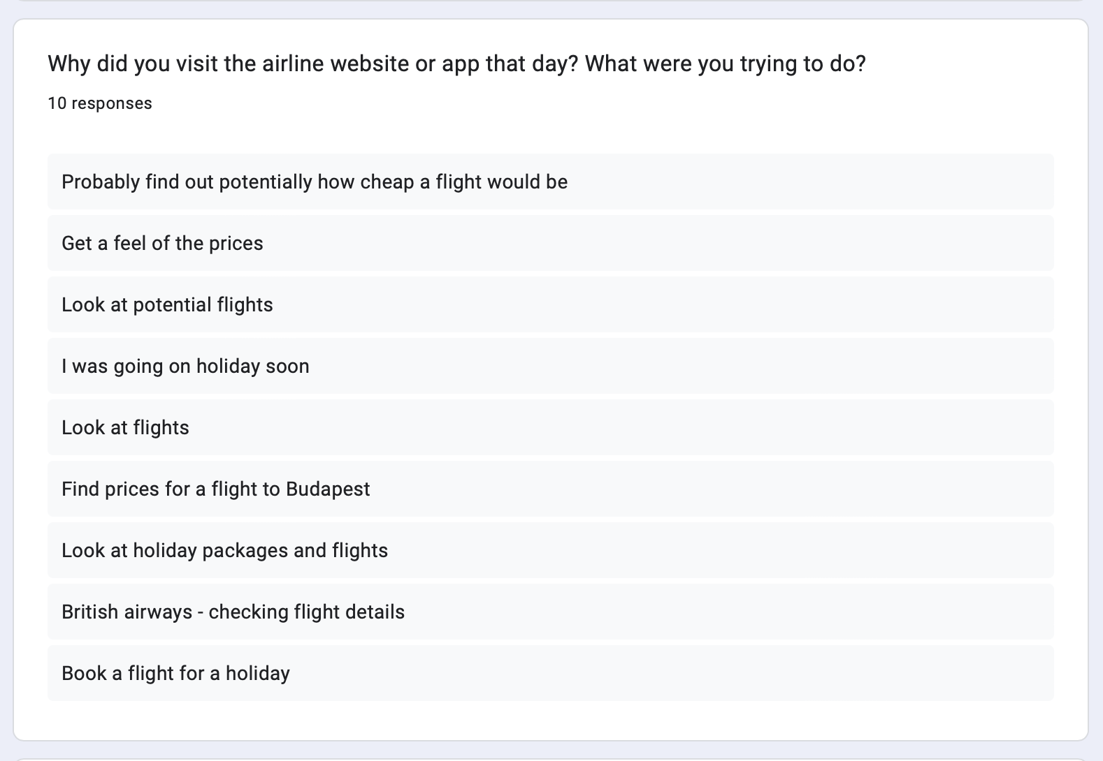
Key insights:
Over 50% of participants wanted to check prices before booking
Responses showed 50% of participants used aggregator websites (e.g. Skyscanner)
Participants said easier/clearer date navigation would be beneficial to their experience
NOTE-TAKING
The task: watch two recorded usability tests and take detailed notes.
The objective of this task:
• become familiar with the process of usability testing before conducting my own session
This task encouraged active listening as I would take notes in order to create a bank of insights which would be valuable for later tasks. I used a colour coded system to categorise the notes into groups and wrote summaries for each participant as this would facilitate faster reflection later on by providing only the most important, condensed information.
Key insights:
+ Familiar terminology made aspects of the process easier (e.g. ‘Promo Code’)
+ Smart defaults - automatically input origin country
- Key CTA (‘Search Flights’ button) was almost missed - “would be better if the button was a more stand-out colour.”
- User irritated by offers of other services early on in the process
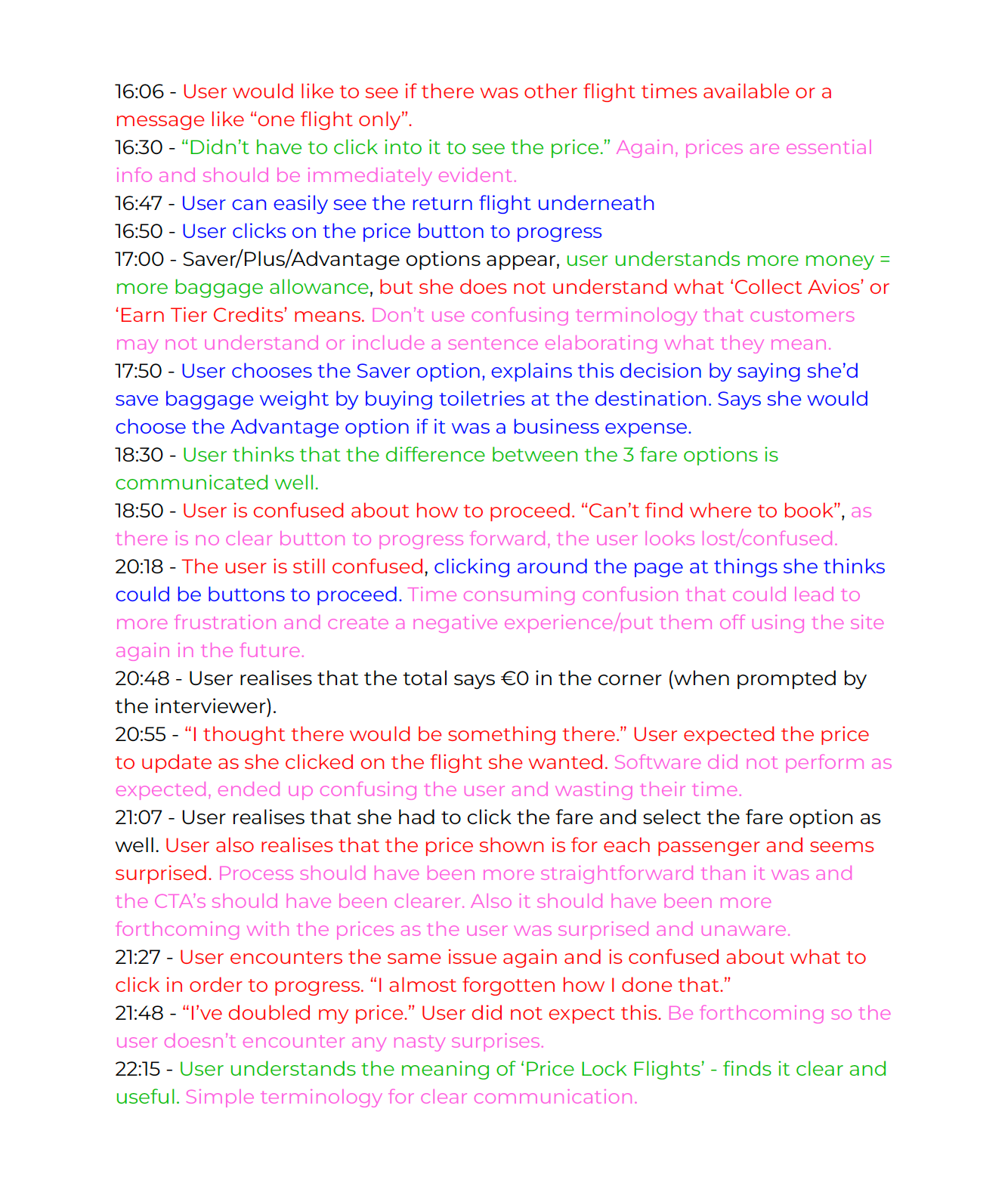
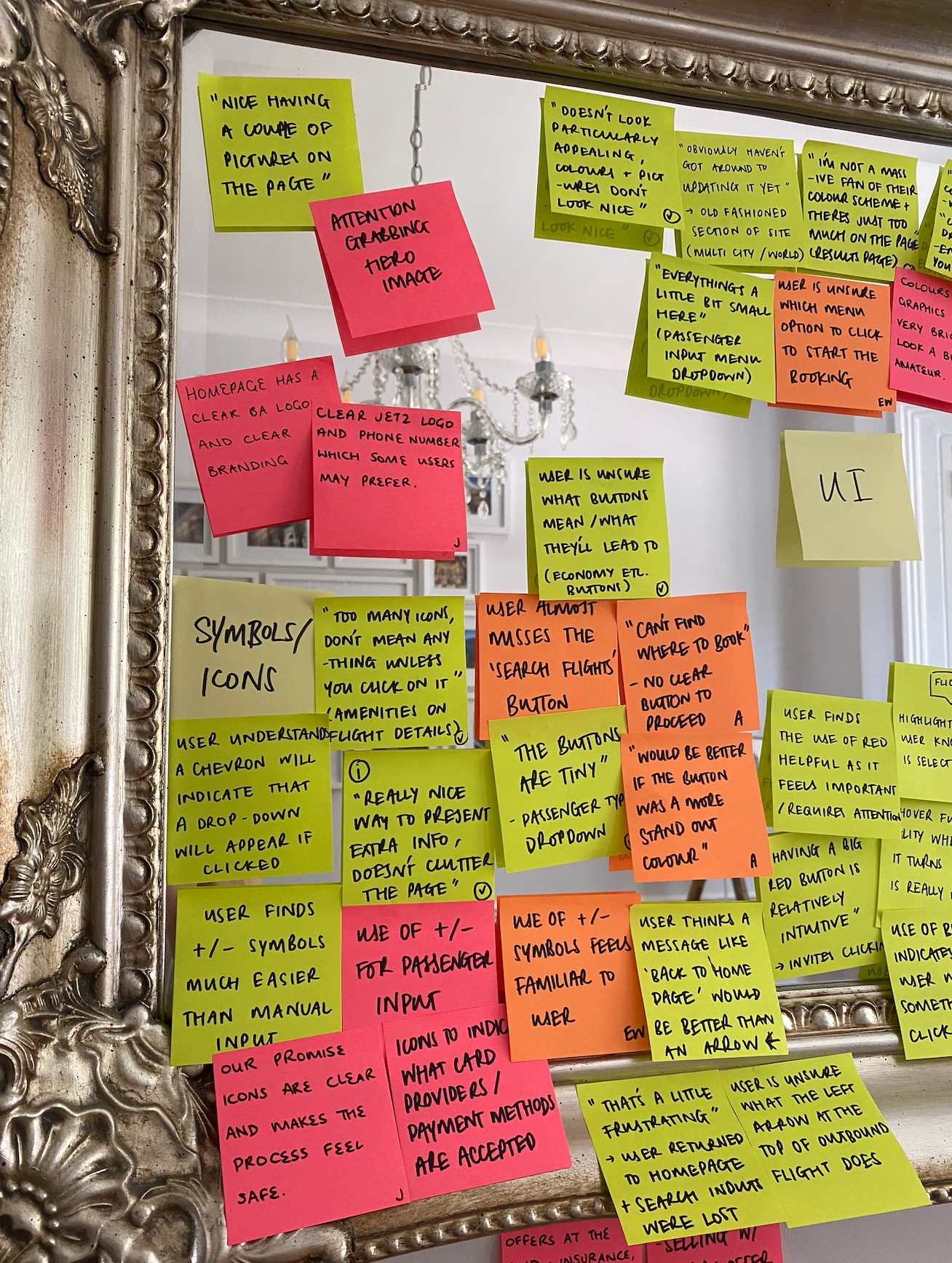
USABILITY TEST
I conducted a usability test using British Airways and Virgin Atlantic. The previous task tested AerLingus and Eurowings, resulting in 3 participants and 4 booking websites being tested in total.
The objectives of this:
• learn about the context of use of people using websites: what are they trying to do, who are they with, where are they, what devices do they use?
• learn about the goals and behaviours of customers when booking
• build skills, experience and confidence in usability testing
• learn to conduct depth interviews and draw insights from users
Key insights:
+ Calendars - easier to use than manual input. “Companies should make sure that calendars are compatible on all devices.”
+ Strong affordances - “having a big red button is relatively intuitive.”
- Terminology - “some of the terminology is different to every other airline”
- Seat map - “seems a complete waste of time, why even show me that part of the plane?” - should have considered the user’s previous travel class selection
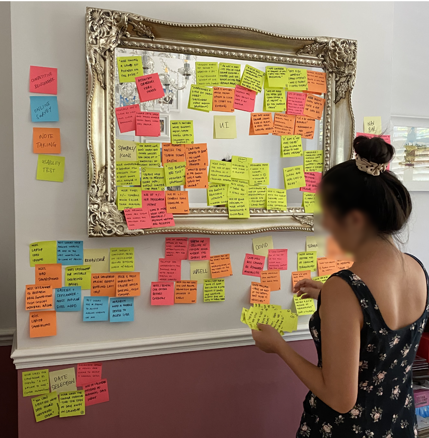
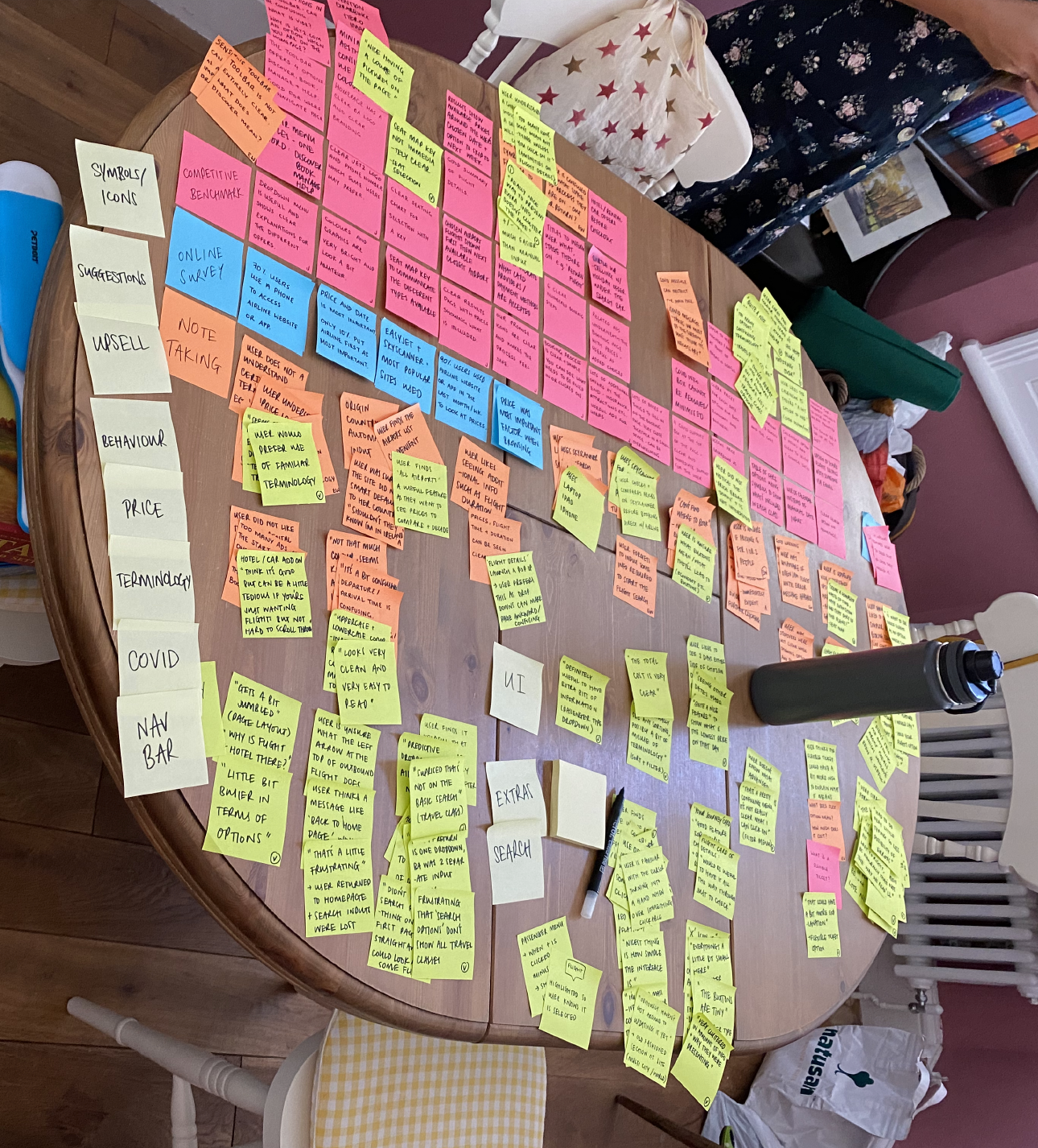
AFFINITY DIAGRAM
The next step in the process was to apply some structure to the qualitative research data collected so far. This meant collating all research conducted up until this point - competitive benchmarking, online surveys and usability tests and then reviewing it with a helper.
The objectives of this task:
• learn how to review large volumes of research and take concise notes
• learn the power of collaborative analysis
Key insights:
+ Users found an airport list/predictive dropdown to be time-saving and useful
+ Users appreciated smart default of automatically inputting their origin country
- Some users were confused if prices shown were for 1 or 2 people
- Users were confused by having too many factors for the search/filter options and unsure of their meanings
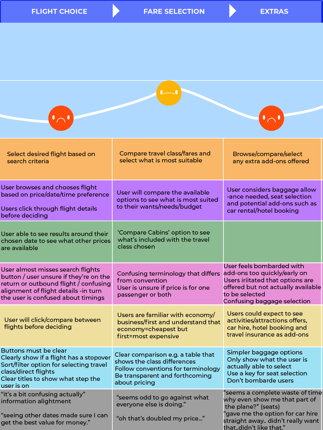
CUSTOMER JOURNEY MAP
I went through each step of a user’s journey during the booking process to better understand how UXWings could solve problems in a more effective way.
The objectives of this task:
• learn how to translate research data into a structured document
• use the map to define the high level steps in the journey
• document the goals of the user, any positives or pain points and whether there was any behaviour that the website was not facilitating
• assess whether each step of the process was positive/negative and add direct quotes for context
Key insights:
+ Using +/- symbols is a familiar convention
+ Users appreciate a summary of selected flights and details before proceeding to the payment page
- Users irritated that options are offered but cannot be selected and users are not told why
- Users are unsure if they’re selecting flights for the outbound or return flight
This process communicated that the flight selection stage was the most problematic for users and this would need to be the main area to focus on when starting my own design for UXWings.
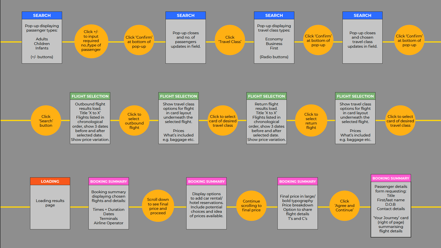
FLOW DIAGRAM
The next step was to map the user’s flow through the website - from homepage to the completion of the transaction.
The objectives of this:
• define the high level booking flow for the new website
• address issues highlighted in the customer journey map
• lay the groundwork on which designs will be built
Key insights:
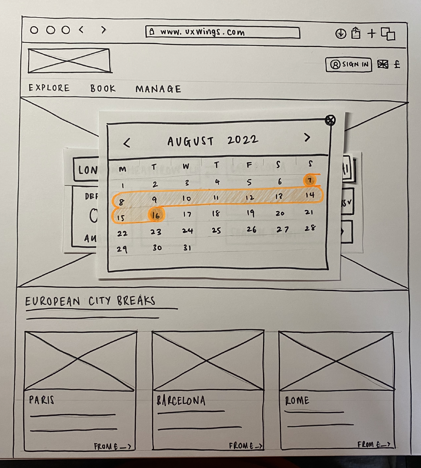
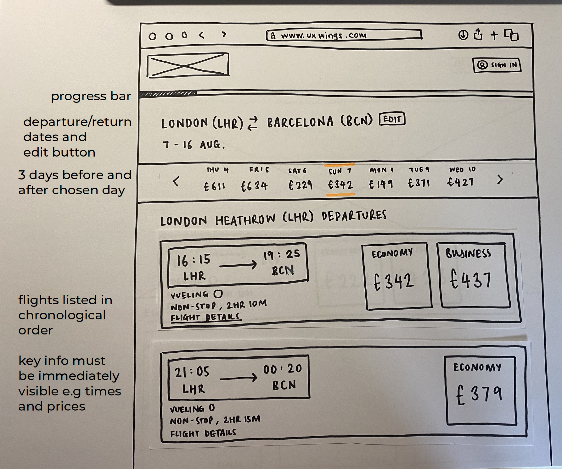
+ Showing the dates around the selected outbound date allows users to see the price variation
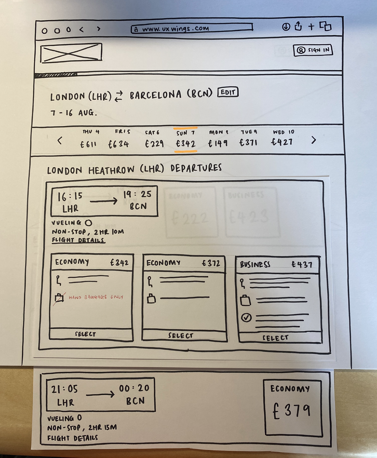
+ Having a booking summary section to allow users to double check details and amend any potential mistakes before progressing to seat selection and payment
INTERACTION DESIGN
After determining the user’s flow, I then began sketching the screens/screen states that the user would be met with when using the website, whilst also keeping in mind the problems and pain points highlighted previously. This was a problem solving process and some screens needed a few iterations before progressing.
The objectives of this task:
• build on the flow diagram and sketch the screens/screen states
• address issues and user goals identified during the research and analysis stages
• learn how to use sketching as a tool for problem solving
• understand how sketching is a vital step before prototyping or digital wireframing
Key insights:
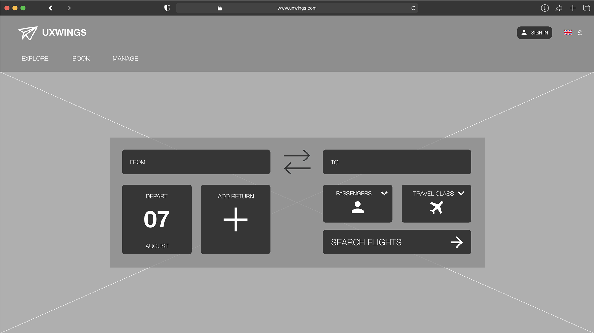
Experimented with different search layouts in order to ensure space was used in an effective way whilst also making sure that the CTAs were clear
Implementing predictive airport dropdown list as this had a positive response from users in the research phase
Calendar instead of manual dd/mm/yyyy input, use of colour and hover functionality for visual clarification
PROTOTYPE
After designing the user’s interaction, the next step was to build a prototype.
The objectives of this:
• ensure the prototype contains enough detail and interactivity to test the high level flow, screen layouts, text and basic interactions
• learn how to use popular prototyping tools
I chose to create a medium fidelity prototype as this would contain enough detail to provide richer interaction and data insights.
Key insights:
I asked users to test the low-fidelity prototype and intitial feedback:
+ flow made sense
- some elements were slightly too large but this could be ironed out by looking at UI kits and interface guidelines
Note: As this stage was focused solely on the user experience, it is not an accurate representation of the user interface or visual design that the end product would have. The link below leads to the prototype, not all elements are clickable and hints are provided to assist progression.
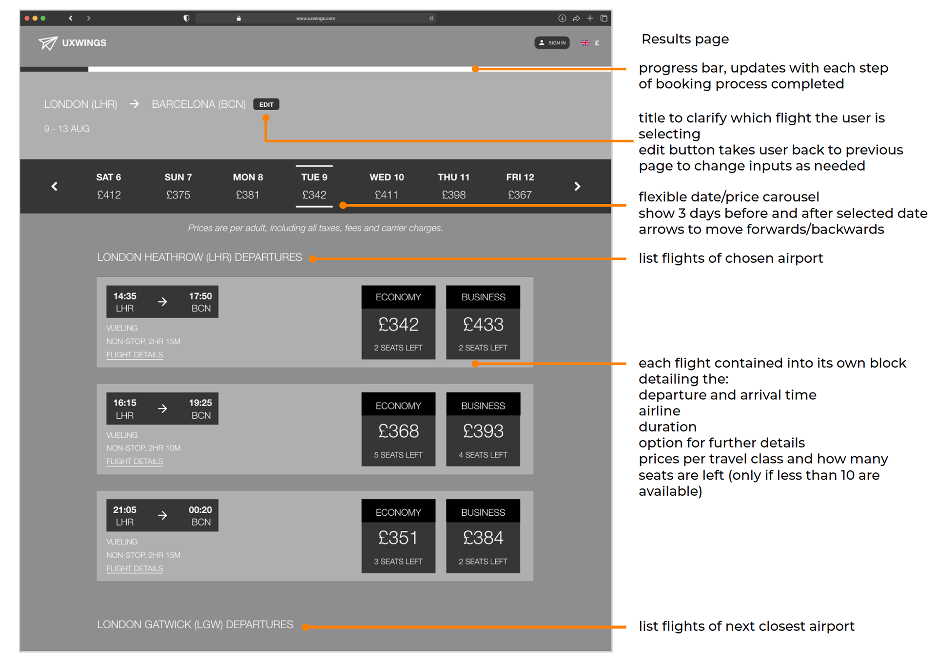
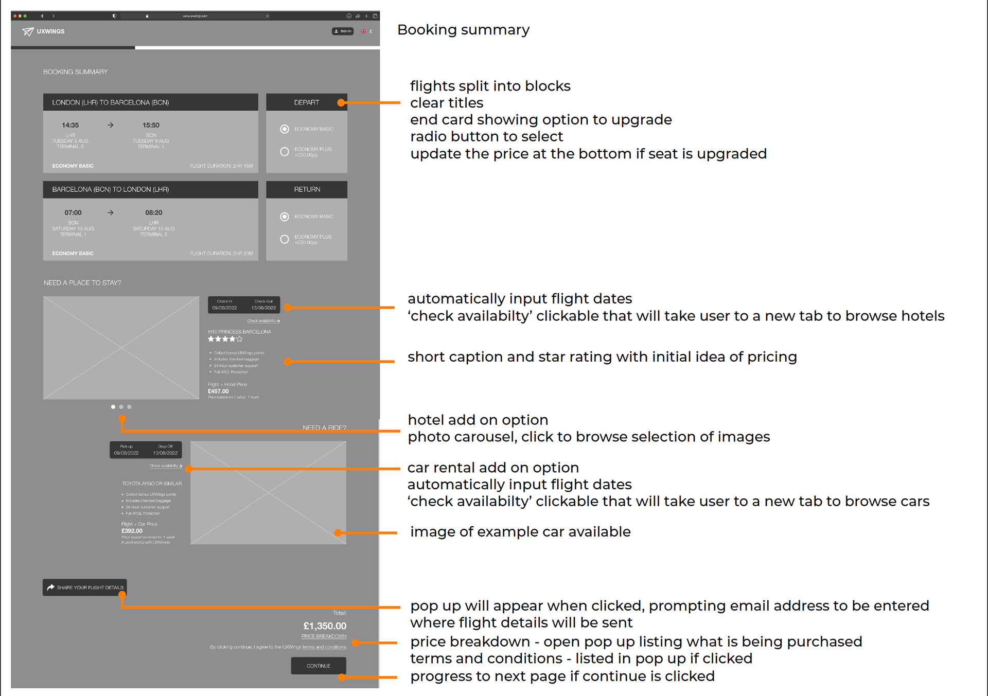
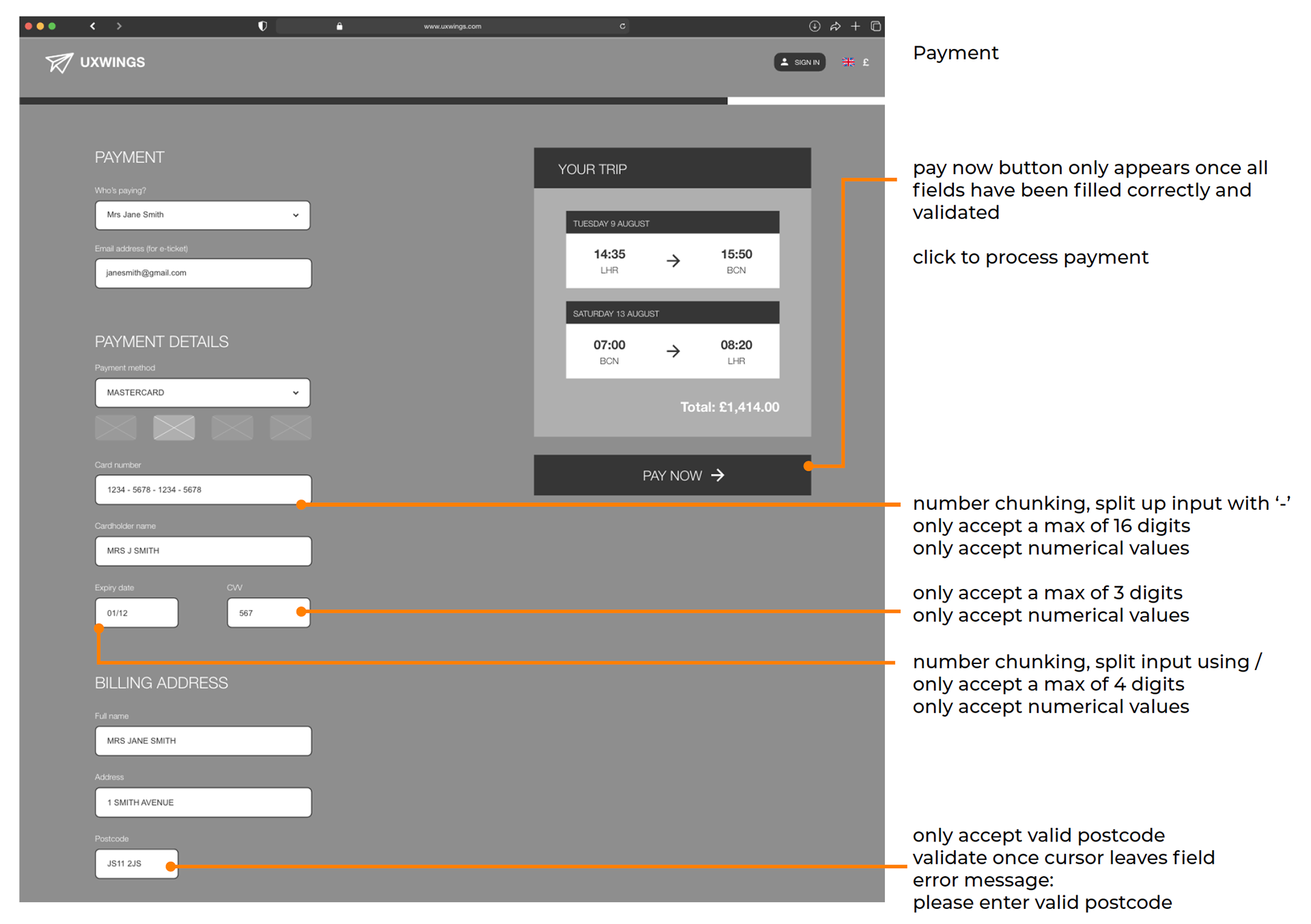
ANNOTATIONS
The final stage of the process was to create a set of annotations as part of the handover documentation for the developer team.
The objective of this:
• ensure the notes contain all the necessary detail that a developer would need to build the website accurately
All elements need to be explained with enough detail so the developer could build the site without any guesswork.
Key insights:
Forms - input fields require extra attention to detail so customers feel confidence/secure when inputting sensitive information (card details).
PROJECT REFLECTIONS
A self reflection on each step of the design process to track my thoughts and developments.